

Have you ever walked into a guest room and felt at home right away? Like a big warm hug? That is the magic of a room made with care. And much of that magic comes from the paint on the walls. Your guest room is not just a bed for visitors. It is a calm place, a small escape, a second home for your friends and family. And making it warm and cozy often starts with the right paint color.
Think about it. When you sleep away from your own bed, you want comfort, right? You want to feel calm and welcome. The color in your guest room can help or hurt that. A bright, loud color can make guests feel restless. A soft, calm color can help them sleep well. It is all about setting the right mood. Paint is your best helper for this.
In this article, we share 20 great guest room paint color ideas. We will not just show you color samples. We will talk about how colors make you feel, how they look in light, and how to mix them with other things to make a warm, lovely room. So get a cup of coffee, get comfy, and let us help you make your guest room the coziest spot.
Why Paint Color Matters So Much in a Guest Room
You may think, it is just paint, how much can it matter? Oh, it matters a lot. This is true for a guest room. Your own room can show your bold taste. But a guest room must please many people. It must feel calm and cozy for all.
The right paint color can make a room look bigger or smaller. It can change how you feel. It can even change how well you sleep. It is a strong tool for decor. Used well, it makes guests feel loved and calm. Think of it as painting a feeling, not just a wall.
Setting the Mood and Tone
Each color makes a feeling. Blue often feels calm. Green links us to nature. Warm light colors feel warm and kind. A guest room should feel comfy, calm, and kind. The paint color sets this base feel.
Think of a room painted soft dusty blue next to a room painted bright orange. Which one makes you feel calm at once? Yes. Mood is all, and paint sets the mood.
Creating an Inviting First Impression
First looks are not just for people. Rooms make them too. When guests open the door, you want them to feel warmth and love. The wall color is the first thing they see. It shows the care you gave to their stay.
A good color choice shows care at once. It makes guests feel special. It says you made this room just for them to rest in.
Influencing Perceived Space and Light
Here is where it gets fun. Paint colors can trick the eye in a good way. Light colors make a room look bigger and brighter. They bounce more light. Dark colors feel cozy, but they can make a room look smaller. That is not bad if you want a small, snug room.
Think about the light in your guest room. Does it get morning sun? Or is it a dark room with little sun? The paint you pick can work with that light. It can make the room feel just right all day.
Understanding Warm and Cool Tones for Guest Rooms
Before we look at colors, let us talk about warm and cool tones. This is a key idea. It shows why some colors feel cozy and others feel too loud or too cold.
Warm colors remind you of the sun or fire. Think red, orange, yellow, and earth brown. Cool colors remind you of water, sky, and plants. Think blue, green, and purple. But there are mixes too. A warm blue may have a bit of green or grey. It feels less cold than a pure icy blue.
Warm Colors: The Hug Your Walls Give
Warm colors are great for guest rooms. They make a room feel kind, close, and yes, warm. They pull the walls closer to you. That is great for a snug room. They are great for rooms that feel cold or plain.
- Examples: Cream, beige, terracotta, soft gold, blush pink, warm grey.
- Vibe: Coziness, comfort, energy, closeness, welcome.
Cool Colors: Serenity and Calm
We want warm and cozy, but cool colors have a place too. They can feel calm and soft. That is part of a cozy room too. The trick is to pick cool colors with a bit of warmth. Or mix them with warm things.
- Examples: Soft blues, muted greens, lavender, cool grey with a blue undertone.
- Vibe: Calm, peaceful, spaciousness, freshness, tranquility.
For a guest room, the best colors often mix warm and cool. Think greige, which is grey plus beige. Think soft greens. Think off white with creamy tones. These colors give both warmth and calm.
The Power of Neutrals: Timeless and Versatile
Soft light colors are the quiet stars of room design. For a guest room, they are a must. Why? They fit all styles. All people like them. They make a calm base so guests can rest. They also let you change pillows and decor later without painting again.
1. Classic Cream: The Ultimate Soft Embrace

Cream is like a warm hug on your walls. It is softer than bright white. It adds soft warmth without being too much. It goes well with almost any color or style. Think of it as a blank page.
- Why it works: It bounces light, feels kind and warm, and never goes out of style.
- Pro Tip: Pick creams with a bit of yellow or peach in them for more warmth. Skip ones with too much grey. They can look dull.
- Pair with: Wood chairs and tables, soft linen beds, and small gold touches.
2. Cozy Greige: The Perfect Blend of Warmth and Sophistication

Greige sits right between grey and beige. It is smart like grey. It is warm like beige. It is loved for good reason. It is new yet classic. And it goes with all.
- Why it works: New, works with all, calming, fits many styles.
- Pro Tip: Try many greige samples. Some look more grey, some more beige. Pick one that fits the light in your room.
- Pair with: White trim, dark wood chairs, and pops of color in pillows or art.
3. Warm Linen White: Crisp But Not Cold

If you like crisp white but fear a cold look, warm linen white is for you. It is white with a bit of cream or beige in it. The chill is gone. It makes a room feel fresh, clean, and so kind.
- Why it works: It lights the room, feels clean, gives a blank base for decor, and stays warm.
- Pro Tip: This is great for small guest rooms. It makes them look bigger.
- Pair with: Textured beds, natural fiber rugs, and plants for a fresh, natural feel.
4. Soft Taupe: Earthy Elegance

Taupe is a soft brown grey. It brings the feel of the earth to a room. It is smart and calm. It makes a soft, classy base for guests to rest in.
- Why it works: Grounding, classy, calming, goes well with warm and cool things.
- Pro Tip: Taupe can look different in different lights. Always test it on your wall first.
- Pair with: Rich cloth like velvet or wool, dark wood, and metal touches.
5. Pale Blush Pink: Gentle and Inviting

Do not say no to blush pink just because it sounds girly. A very pale, soft blush can be classy and warm. It adds soft love without looking too pink. It goes with much and makes a soft, kind room.
- Why it works: Soft, gentle, adds warmth, feels cozy and chic.
- Pro Tip: Pick blush with a bit of beige or grey. This keeps it from looking too sweet.
- Pair with: White, light grey, gold, and natural wood for a new, calm look.
Embracing Deeper Hues for Intimate Coziness
Soft colors are great, but sometimes you want more depth for coziness. Deep, rich colors can make a room feel close and rich. Your guest room will feel like a special treat. Do not fear a darker color. It can wrap you like a hug.
6. Dusty Blue: Serene and Soothing

Dusty blue is a softer, duller blue. It has a bit of grey. The grey takes away the cold. It gives a calm, soft feel. It is like a clear, calm sky on a cloudy day.
- Why it works: Helps you rest, feels calm, and a bit classy.
- Pro Tip: Pick a dusty blue with a bit of green or grey in it. This keeps it warm, not icy.
- Pair with: Cream, white, light wood, and natural cloth to keep an airy feel.
7. Sage Green: Nature’s Embrace

Sage green is a dull, earthy green. It links a room to nature at once. It calms and freshens. Guests feel like they are in a calm green spot. It is classy, classic, and goes with much.
- Why it works: Calming, healing, good for health, and adds natural class.
- Pro Tip: Sage comes in many kinds. Some are more grey, some more olive. Pick one that fits the light in your room.
- Pair with: White, natural wood, terracotta, and lots of plants for a true natural feel.
8. Warm Terracotta: Earthy and Grounding

Terracotta is not just for pots. A warm, soft terracotta on walls brings great warmth and earth feel. It adds a boho charm to a guest room. It feels grounded and kind, most of all in rooms with good light.
- Why it works: Rich, earthy, kind, adds a unique world feel.
- Pro Tip: Use terracotta in a room with lots of light. This keeps it from feeling too heavy.
- Pair with: Cream, olive green, natural wood, and woven cloth for a sunny beach or desert feel.
9. Deep Olive Green: Sophisticated and Cozy
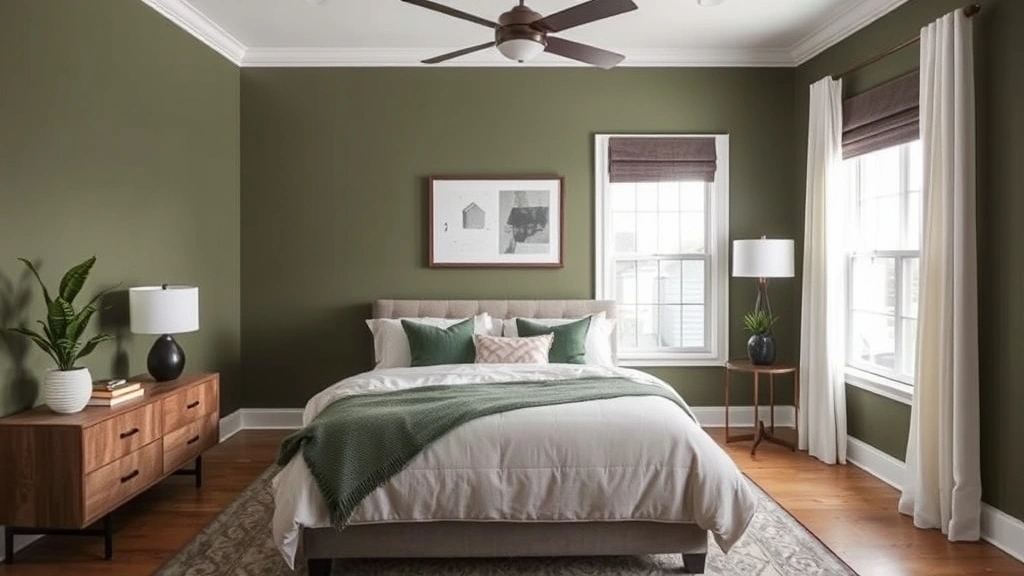
For a deep, classy feel, dark olive green is lovely. It is rich and moody. It makes a close, den like room that is great for rest. It is a natural, rich choice.
- Why it works: Makes a close, rich, and very calm room.
- Pro Tip: Mix this dark color with light beds and metal touches. This keeps it from feeling too dark.
- Pair with: Gold touches, dark wood, cream or white beds, and a bit of dark red or rust.
10. Muted Lavender: Tranquil and Dreamy

A soft, dull lavender with grey in it can feel so calm and dreamy. It is not bright purple. It is a classy, light shade that helps you rest. It is a rare choice that can feel very special.
- Why it works: Brings calm, feels rare, adds a soft, dreamy feel.
- Pro Tip: Make sure the lavender has enough grey or beige in it. This keeps it from looking too young or too bright.
- Pair with: White, light grey, silver touches, and soft, rich cloth.
Brightening Up with Subtle Pops of Color (Still Cozy!)
Cozy does not mean no color. The trick is to pick soft, dull kinds of bright colors. These give a happy feel without being too much. They keep the room calm and kind.
11. Soft Buttery Yellow: Gentle Sunshine

A very soft, pale buttery yellow brings a bit of sun into a guest room. It is warm, happy, and kind without being too bright. It is like soft morning light on your walls.
- Why it works: Lifting, warm, kind, adds cheer without being too much.
- Pro Tip: Skip very bright or pure yellow. Look for shades that are almost cream, but with a clear yellow tint.
- Pair with: White, light grey, natural wood, and a bit of light blue for a fresh feel.
12. Muted Robin’s Egg Blue: Cheerful Calm
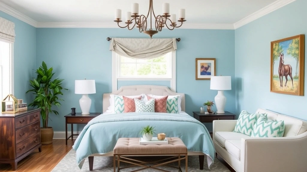
Robin egg blue is a pretty, light blue with a bit of green. When soft, it is a happy yet calm color. It feels like clear skies and fresh air. It is a sweet choice that feels both glad and calm.
- Why it works: Uplifting, calming, fresh, adds fun class.
- Pro Tip: This color looks great in rooms with good light. It makes them feel even more airy.
- Pair with: White, cream, light wood, and a bit of soft coral or peach.
13. Faded Denim Blue: Relaxed and Familiar

Think of your favorite old jeans. That is the feel faded denim blue brings to a room. It is a casual, comfy blue that feels known and easy. It is more dull than navy. So it is less strong but still rich.
- Why it works: Calm, known, cozy, and goes with much.
- Pro Tip: This color is great for a beach or farmhouse guest room.
- Pair with: White, wood tones, wicker, and natural fibers for a very easy feel.
14. Soft Peach/Apricot: Warm and Welcoming
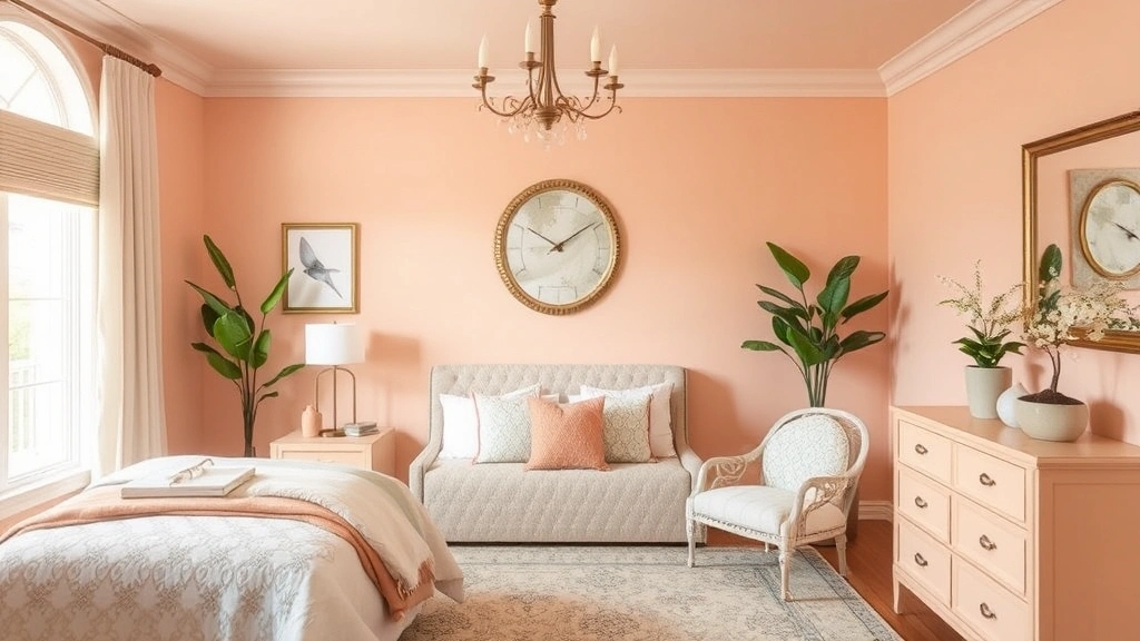
A very soft, dull peach or apricot can be so warm and kind. It is a soft, happy color that adds a healthy glow to a room. It is plain enough to be a neutral but has extra warmth.
- Why it works: Kind, warm, happy, adds a soft, rare touch.
- Pro Tip: Pick peach that leans to soft terra cotta or blush, not bright orange.
- Pair with: Cream, gold, light wood, and a bit of soft green for a fresh, warm mix.
15. Seafoam Green: Coastal Tranquility

Seafoam green is a soft, pale green with bits of blue. It feels like calm ocean water. It soothes and freshens. It brings a beach calm to any room. It is light enough to brighten a room but still has its own style.
- Why it works: Calm, fresh, soothing, brings peace and nature.
- Pro Tip: This color is great for a spa like calm in your guest room.
- Pair with: White, sandy beige, natural wood, and shell touches.
Going Darker for Dramatic Coziness
Do not fear dark colors if you want a bold, close, very cozy guest room. Done right, dark colors feel rich and wrap you up. The room feels like a classy hug. The key is to mix them with lots of light things and good lights.
16. Deep Teal: Rich and Luxurious
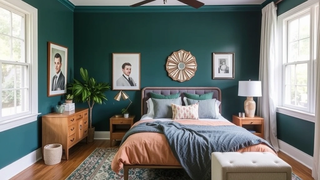
Deep teal is a lovely jewel color. It mixes the calm of blue with the fresh feel of green. It is rich and classy. It makes a close, rich room. It feels like a hug on your walls.
- Why it works: Rich, close, calming, adds drama and class.
- Pro Tip: Use this color in a room with at least one window. This keeps it from feeling too much like a cave.
- Pair with: Gold touches, dark wood, white or cream beds, and a bit of blush pink or mustard yellow.
17. Charcoal Grey: Modern and Grounding

Charcoal grey may sound scary, but it can be so classy and cozy in a guest room. It makes a new, grounded feel that wraps you up. It is a strong neutral. It lets other things in the room shine.
- Why it works: New, classy, grounding, makes a close, den like feel.
- Pro Tip: Use lots of lights and light cloth to balance the dark charcoal.
- Pair with: White trim, light wood, metal touches in silver or gold, and pops of bright color in art.
18. Forest Green: Deeply Natural and Serene
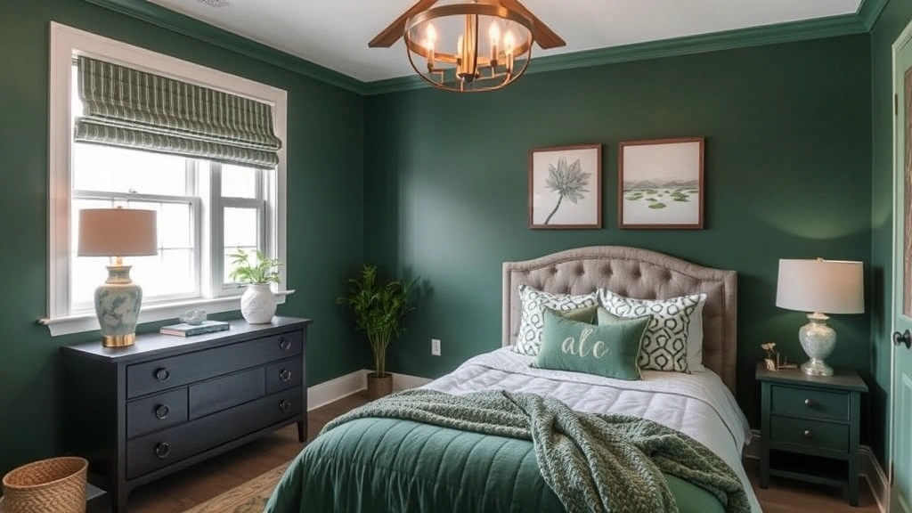
A deep, rich forest green brings the calm of nature inside. It is a strong, grounding color. It makes a deep calm, classy room. It feels rich and cozy, like sitting in a green forest.
- Why it works: Very calming, rich, grounding, links the room to nature.
- Pro Tip: This color is great for one bold wall if you are not ready to paint all four walls.
- Pair with: Natural wood, leather, brass touches, and white or cream beds.
19. Warm Navy Blue: Classic and Inviting

Navy can look cool, but a warm navy blue with a bit of grey or purple in it is so classic and kind. It is classy, calming, and timeless. It is a dark neutral that never goes out of style.
- Why it works: Classic, classy, calming, gives depth and closeness.
- Pro Tip: Navy looks great with crisp white trim and beds. This makes a fresh, sailor like look.
- Pair with: White, cream, gold or brass touches, and natural cloth like jute or rattan.
20. Burnt Orange/Rust: Earthy and Bold
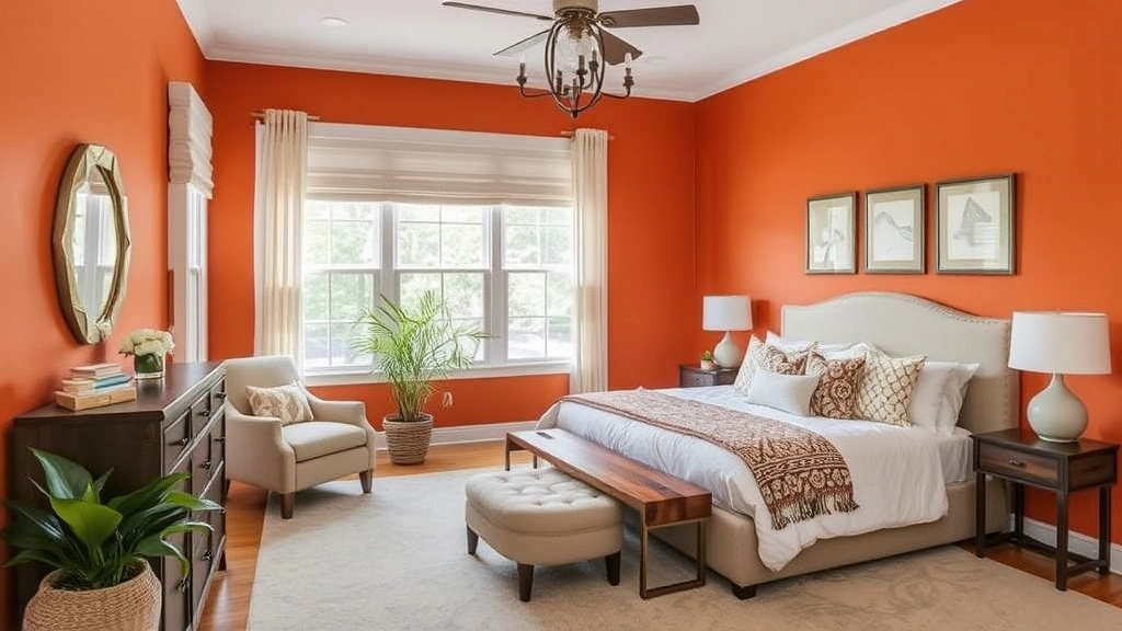
For a guest room that dares to be bold, soft burnt orange or rust is lovely. It is earthy, warm, and so kind. It brings boho warmth and charm. It feels exotic yet cozy.
- Why it works: Bold, earthy, warm, kind, adds a bright, rare charm.
- Pro Tip: This color works best in rooms with good light. Mix it with lots of neutral tones.
- Pair with: Cream, olive green, dark wood, and woven cloth for a world like, cozy look.
Practical Tips for Choosing and Applying Your Guest Room Paint
Picking the color is just the first step. Now comes the fun part of making it real. Here are easy tips so your guest room paint job goes well. They help you get the warm, cozy room you dream of.
Test, Test, Test Your Colors!
I cannot say this enough. A color that looks great on a small paint chip or a screen can look so different on your wall. Paint colors change a lot with natural and man made light, time of day, and even the colors of your chairs and tables.
- Get Samples: Buy small sample pots of your top 2 or 3 picks.
- Paint Swatches: Paint big test spots, at least 2 by 2 feet, right on your guest room walls. Put them on different walls if you can, most of all walls that get different light.
- Observe: Live with the test spots for a few days. Look at them in morning light, afternoon sun, and night lights. See how they change.
Consider the Room’s Natural Light
This changes all. The way your guest room windows face will change how a color looks a lot.
- North-facing rooms: Get cool, soft light. Warm colors like cream, soft yellow, and warm greige can help. They make the room feel less chilly.
- South-facing rooms: Get bright, warm light all day. You can use cooler tones here like dusty blue and sage green. They keep the room from feeling too hot. Or keep the warmth with deep, cozy colors.
- East-facing rooms: Get sweet, warm morning light, but can be cooler in the afternoon. Colors that look good in warm and cool light, like greige or soft green, are often a good pick.
- West-facing rooms: Get strong, warm afternoon and night light. Light, slightly cool colors can balance this strong warmth. Or lean into it with rich, deep colors for a night glow.
Think About the Existing Elements
Unless you redo all, your guest room may have some things you will keep. Work with them. These include:
- Flooring: Is it dark wood, light carpet, or something else?
- Furniture: Do you have a dark wood bed, a light cloth headboard, or metal pieces?
- Trim Color: Most homes have white or off white trim. Make sure your wall color fits it.
- Bedding/Curtains: If you keep these, make sure your paint color goes well with them.
The goal is to make all fit, not to clash. Use these things as part of your color plan.
Don’t Forget the Ceiling!
Most people pick white ceilings, but you can try other looks:
- Lighter Shade of Wall Color: Painting the ceiling a lighter tint of your wall color can make the room feel taller and bigger. It gives a smooth, all round feel.
- White: Classic, bright, makes the room feel taller.
- Darker Shade: In a very big room, a darker ceiling can make it feel more close and cozy. But be careful. It can feel heavy in small rooms.
Layering Textures and Lighting for Ultimate Coziness
Paint is the base, but cloth and light are the secret to true coziness. Once your walls are painted, add warmth with:
- Soft Bedding: Think layers. A duvet, a throw blanket, and lots of pillows in different cloth like linen, cotton, and knit.
- Area Rugs: Warm cold floors and add more cloth and color.
- Curtains: Drapes in a fit color and a thick cloth can add warmth and softness.
- Warm Lighting: Skip harsh top lights. Use bedside lamps with warm bulbs, around 2700K, for a soft, kind glow. A dimmer switch is a great add.
- Personal Touches: A small plant, a pile of fun books, or a sweet candle can make a guest room feel truly special and lived in.
Making Your Guest Room a True Retreat: Beyond Paint
Paint is strong, but a truly warm, cozy room needs more than walls. Think of the whole stay you want to give. What makes you feel comfy and cared for when you stay somewhere new?
Comfort is Key
First of all, comfort. That means a good mattress, good pillows, and soft, clean beds. No pretty paint can fix a lumpy bed. Think of:
- Mattress Topper: If your guest mattress is not new, a topper can make a big change.
- Pillow Options: Give a few pillow kinds, some firm, some soft, so guests can pick what is best for them.
- Extra Blankets: Keep a throw blanket or extra duvet folded at the foot of the bed or in the closet.
Thoughtful Amenities
Small touches go far in making guests feel truly welcome:
- Fresh Water: A jug of water and glasses on the nightstand.
- Charging Station: A charger with many ports or easy to reach plugs for phones.
- Wi-Fi Password: Shown clearly in a frame.
- Reading Material: A few new magazines or fun books.
- Basic Toiletries: Small bottles of shampoo, conditioner, soap, and lotion, even ones from a hotel stay.
- Towels: Fresh, fluffy towels easy to reach.
- Empty Closet/Drawer Space: Clear some space for their things.
Sensory Delights
Wake the senses to make the cozy feel stronger:
- Scent: A soft diffuser with a calm oil like lavender or cedarwood, or a nice candle, unlit, with matches near. Go light on scents, as some people are touchy about them.
- Sound: A white noise machine can be a gift for light sleepers or people in new places.
- Sight: Beyond paint, good art and decor that feel calm.
Privacy and Control
Guests like to control their room:
- Window Treatments: Blackout curtains or blinds are a must for good sleep.
- Thermostat Access: If you can, let them change the room heat or cool. Or give clear steps on how to do it.
- Door Lock: A simple lock inside the door gives more safety and privacy.
Mix the perfect paint color with these kind touches, and you will not just have a guest room. You will have a warm retreat your friends and family will love and talk about.
Conclusion: Your Guest Room, A Haven of Hospitality
There you have it, 20 great guest room paint color ideas. Each one helps you make a warm and cozy retreat. From classic cream to deep teal, paint can change a room in a big way.
Keep in mind, the goal is to make your guests feel loved, calm, and at home. The right paint color sets the stage. It makes a calm, comfy air that asks them to rest and enjoy their stay. Do not fear testing samples, think of your room light, and add kind touches that make a plain room feel rich.
So go ahead, pick your loved shade, take that paintbrush, and start making a guest room that feels like a warm hug for all who step in. Your friends and family will thank you.
Meta Description Suggestion: Discover 20 great guest room paint color ideas for a warm and cozy retreat. From calm neutrals to deep, kind colors, find the right shade to make your guests feel at home, with easy tips and ideas.
Stay Updated
Subscribe with your email and get notified whenever we publish new posts.